Sunday, July 17, 2011

Thematic Map Florida


The map above is a thematic map of the southern half of Florida. This map shows the old people percent of the population of the given areas (Counties I believe). The darker greens represent high portions of the population and lighter greens represent smaller portions of the population.

Propaganda Map USSR


This propaganda map was pretty funny to me at first glance. What it made me think of was that its was trying to depict the way Russians see the world. It makes me think that Russians saw the world as a frontier to be captured from their home base.

Compound Bar Graph China


This graph is a type of histogram that shows more than one observable variable at once per each variable being observed. The things being observed are the countries and the things being observed about them are the incomes in the years 2008, 2009 and 2010.

Nominal Map USA


This United States map shows us only a few things. It shows the boundaries of the land and the capital of each state. Both of these categories of data are nominal. That makes this a nominal map.

Isoline Chloropleth Map Canary Islands


This isoline chloropleth uses contour lines to group areas of land that have similar altitudes. This one in particular shows the regions of the island's distance above sea level converging to a high point, probably ab mountain.

Albers World


This world map is an Albers map. Using the Albers projection the distances between the landmasses are minimally distorted but the shapes and sizes of the landmasses are fairly distorted.

Mercator Map World


This is a Mercator world map. What is unique about Mercator maps like this world map is that the polar regions have size and shape distortions because the lines of longitude that converge at the poles don't converge in this type of projection so the landmasses seem larger than they actually are.

Animated Cartography


The map is a map of the coast of Indonesia. The trick is, its animated! This map displays the movement of water after an earthquake that caused a tsunami. Visualizing this movement would be difficult using standard cartographic methods but animation eliminates that problem in those kinds of situations.

Index Value Graph Woodlands


This Index Value plot is representative of the condition of a certain area of woodlands over time. The downward movement of lines across time represents the improvements in the condition and the upward changes in the index value represent a decline in the woodland condition.

Mental Map


This is a mental map of a an idea a person had for a city center. What mental maps like this do is render a visual representation of things that aren't actually tangible. This center has yet to be constructed so there is no real geographical representation that can be constructed, instead there is a way to render what is only so far real mentally.

Population Pyramid USA


This graph is a population profile or population pyramid. What this one shows is the number of men and women in each age bracket in the United States in 1950 just about the time of the Baby Boom, note the tremendous number of people from 0-4 years old.

LIDAR NYC


This visual representation of the post 9/11 Ground Zero site was rendered using laser imaging from an aerial view. This LIDAR image shows how the elevation of objects by detecting how far they are from a plane mounted laser flying over the area. Blue is closest and Red is most far. The image was used to find  rubble piles and heights in the smoke.

Proportional Circle Map- Continuously Variable France


This proportional circle map has continuously variable. It shows the amount of meat that was sent to each region of France represented by circles. The larger the circle, the more meat that was sent. The difference between the continuously variable circle map and the range graded one is that there aren't groups of data ranges that are represented by circle sizes. This serves as a more accurate vehicle for comparing the differences in the data.

Proportional Circle Map- Range Graded Europe


This is a proportional circle map of the European countries. What it displays is the number of people that use the internet. The larger the circle, the more internet users. The thing that makes this map range graded is that there are threshold type intervals for the circle sizes.

Dot Distibution Map Lake Erie


This map is shows the population of the areas around Lake Erie. Each yellow dot represents a specific number of people, in this case 2500. The areas that just seem like a cluster of yellow have tremendous numbers of 2500 person yellow dots in close proximity across a vast area.

DOQQ Nebraska


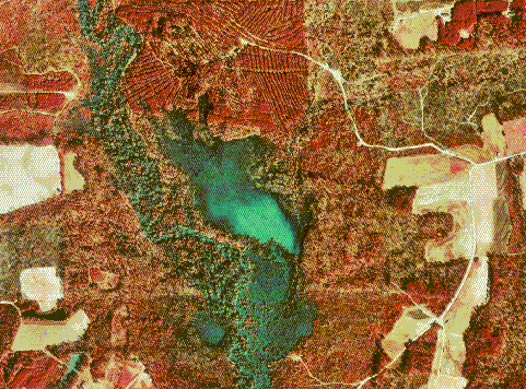
This map of digital orthographic quarter quads covers the area of Johnson County, Nebraska. each of the the pixel regions are one meter by one meter and this particular image is in infrared vision.

Public Land Survey System Alaska


This map is generated by a public land survey system. What is shows is the areas of land that are owned by private property owners, the federal government and the state of Alaska.

Digital Elevation Model Mars

 
This model is a digital rendering of the surface of Mars. What it is displaying is the variance in elevation of the surface buy using three dimensions. 

Lorenze Curve

 
This graph plots what is calculated to be perfect equity against a the lorenz curve, which represents the real income of the population. What it points out his how income is distributed unequally across the total population. 

Windrose


This graphic is a windrose. What is displays is the wind speeds and in which direction these winds are blowing based on a compass rose.